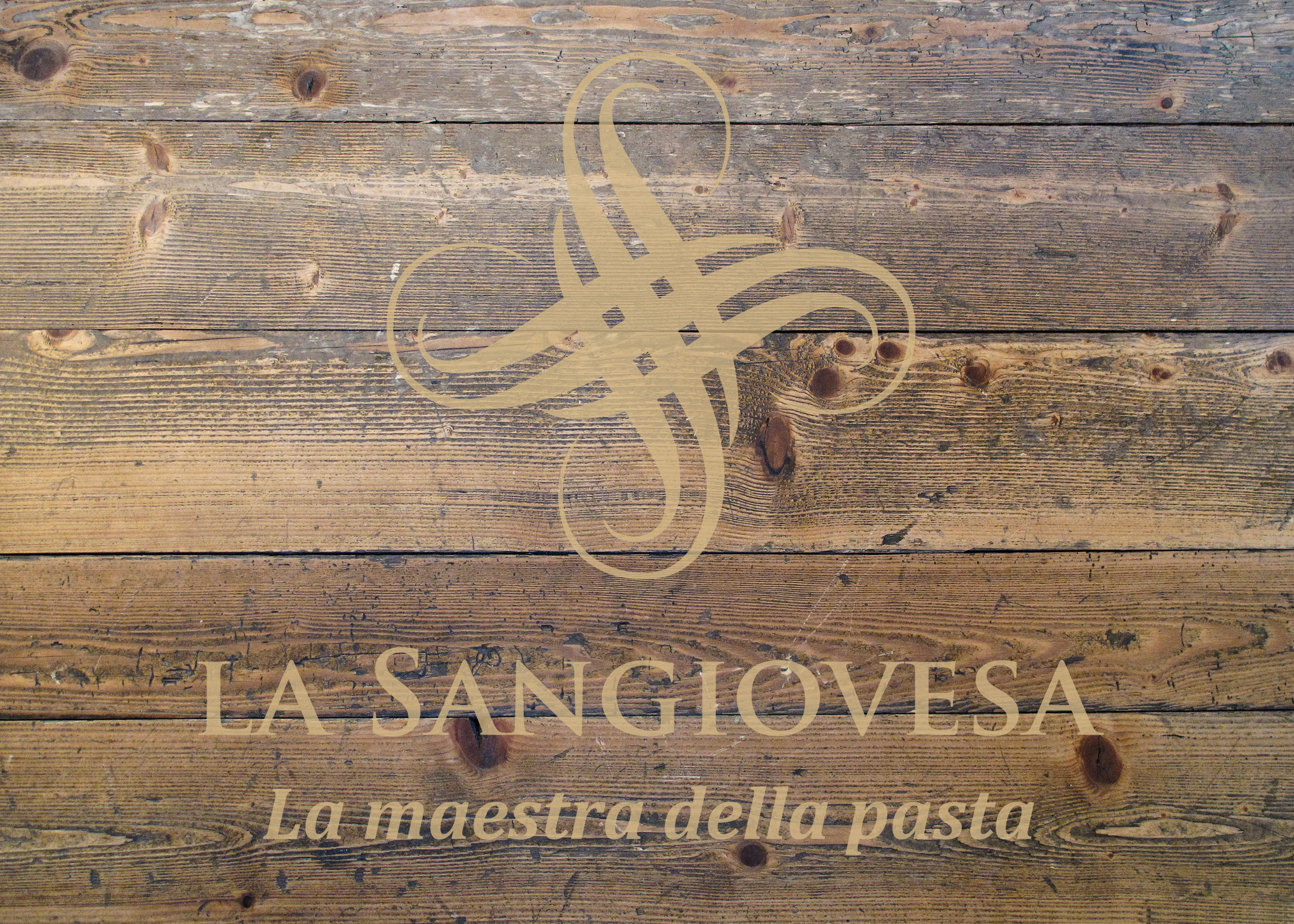
La Sangiovesa
Serenity, balance and meeting
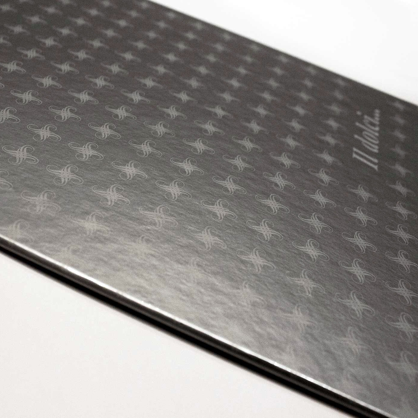
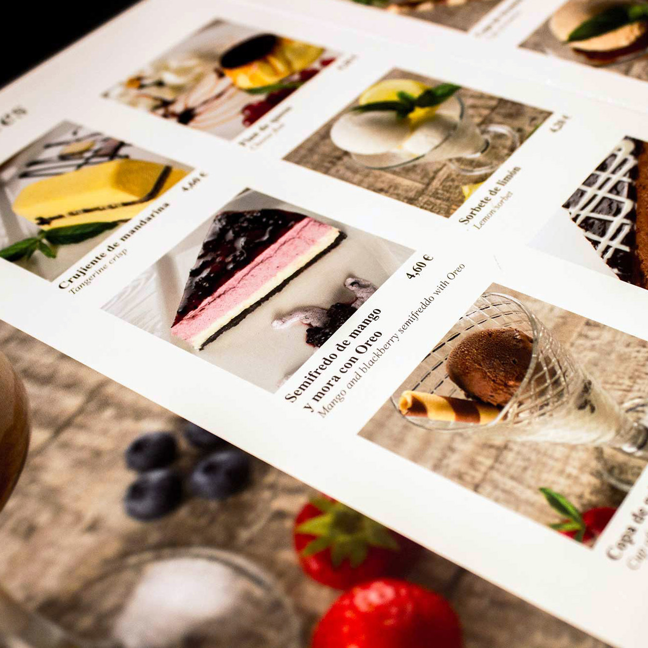
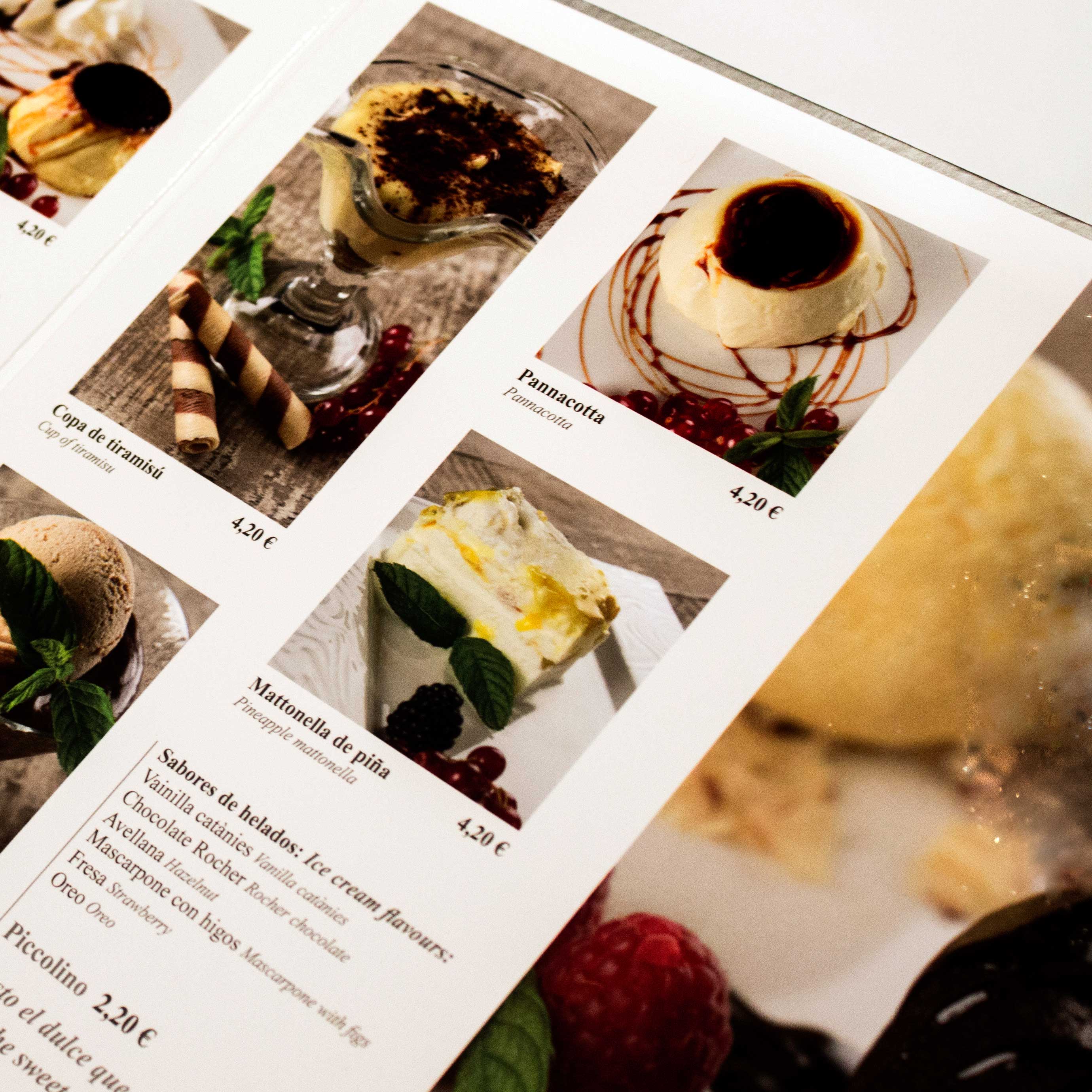
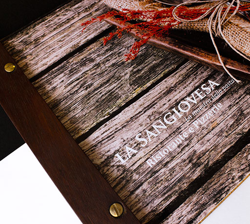
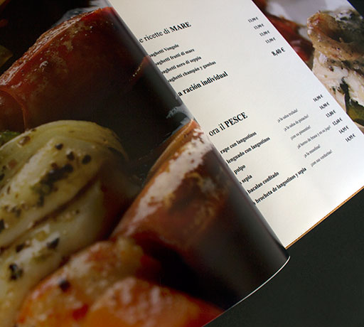
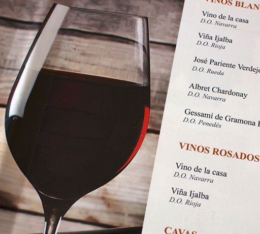
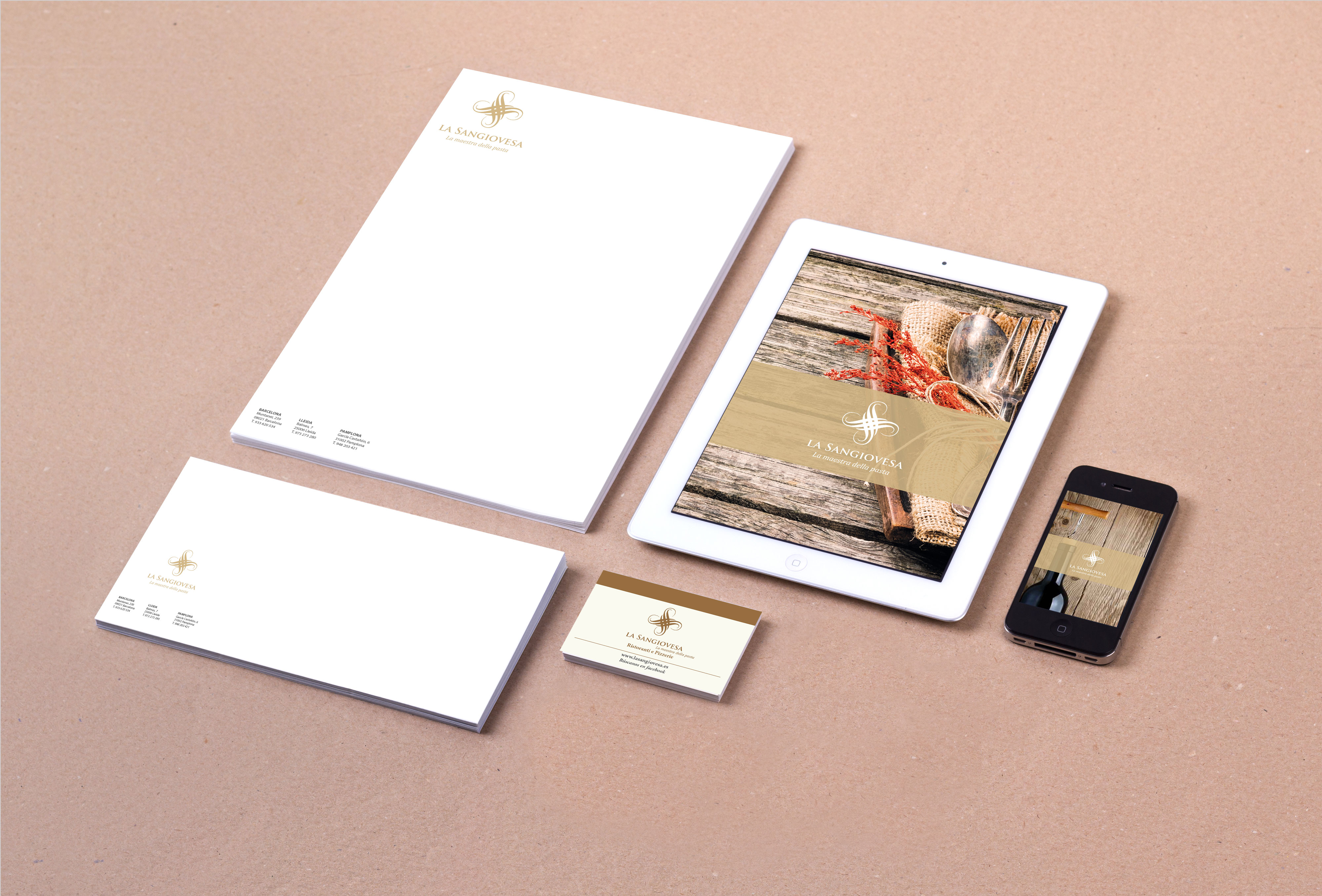
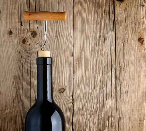
Under these three concepts, the new corporate visual identity develops. It is a remote gastronomic world and closer to the more dynamic business world identity. Built with a chromatic range based on earth tones and grey gives us the desired warmth with the product. The graphic style of stationery and cards menu, desserts and wines combining images of still lives, the protagonist was drawn wood and it is not only the main element and symbol but also the basis of all graphical applications.


A unifying design
La Sangiovesa is a national franchise of restaurants specialised in Italian cuisine. For its expansion, it needed to consolidate and lay the foundations for a corporate visual identity that would allow him to grow consistently, an umbrella identity together all of those directed to its franchisees' visual messages.